Thursday, 23 February 2012

High Above the Clouds [text]


Have you ever wondered where the rain and sunshine come from?
Who controls the weather, the wind, thunder and Summer?

You only have to look up
High above the highest clouds,
with blistering sun and thunder so loud,
This is the story of the Sun sprite and Storm King

Their diaries are packed
with circled dates and highlighted times,
overloaded with various weather signs,
His tidy and neat, hers wild, overflowing from desk to seat

Their differences are clear
The reserved Storm King cold and stern,
Errupting and pouring upon his turn
Interrupted by the Sun Sprites cheek,
spiralling within an unstoppable game of hide and seek

But one day
the Storm Kings patience finally cracked,
he spat and sizzled emphasizing the manners he lacked
While the Sun Sprite fumed,
"What good are you? So useless!" She loomed

I am a Goddess
My long golden rays produce light,
warmth and power - and much needed sight!
I rise early without rest, feeding and ever supplying - surely because I am the best!

How foolish!
For I am the Sky King,
under my command the waves crash and winds sing
I carry the rain in my cloud,
My voice projected through water and sound!

[in progress]

Wednesday, 22 February 2012

Animated work

Not to long ago I posted the work of omocat whom's artwork generally took on an animated approach. Varying from basic filter effects to actual moving parts. I attempted a basic edit on one of my older sketches while taking a break from working on my project and this was the outcome. 


It's really erratic in terms of effects and movement but I now understand the general gist of it so I can attempt at making some more suitable imagery with better effects.


High Above the Clouds


[Will continue to update this post as I work]

I've started drawing out and colouring some pages so I have a better idea of how it looks when it's all complete.
Originally in my first plan I used a square page template - I then drew them out in A5 sized boxes.
I then decided they looked much better 300x300mm thus I reverted back to this and modified my drawings to suit the frame. I've been really torn over how to shade/line and colour these pages, my original method on my previous sketch meant relining using my tablet pen on PS - but this did take AGES. So I tried an older method using Flash to achieve a smooth varied line - this was faster and just as effective. 

I've gone for a sort of scribbled look - overlaying lots of old textures I created for a previous book project [The Iceberg] I've tried to limit the shades to a degree - but I find the more colourful it is the more appealing it is for a child. 

I think with art styles - a child doesn't comprehend these sort of details - such as a limited colour pallet - a child wont look for a reason or find an appealing nature from this like an art student might. During my child development course a few years back I was taught that children are drawn to colours and shapes naturally as part of their development.  Therefore I have let more shades surface within the imagery alongside various textures, prints and smaller details to generate interest.


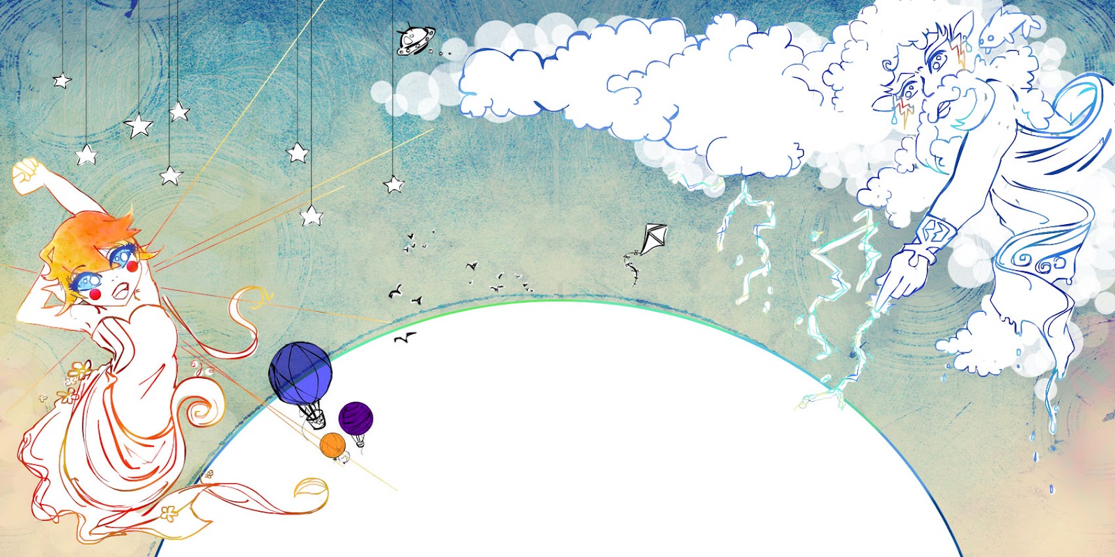
As this page deals with a confrontation I have made the bordering lines particularly scribbley and chaotic. 


[an example of a double page spread]


Complete double page spread. 


/Example showing bleed margins and page fold


Wednesday, 8 February 2012

The Joy of Books


Felt this was appropriate considering my current brief 
The amount of time it must take to make things like this is beyond me.

I'd quite like to attempt something like this when I get some free time
=]


A friend showed me this recently - rather than creating a new post I decided to add it on to the end of this one as both are animated examples. I loved the textures used within this animation - the further in it gets the more use of coffee splattered paper and grime is introduced. 

Thursday, 2 February 2012

Sun Sprite


Posting some progress from my current brief! 
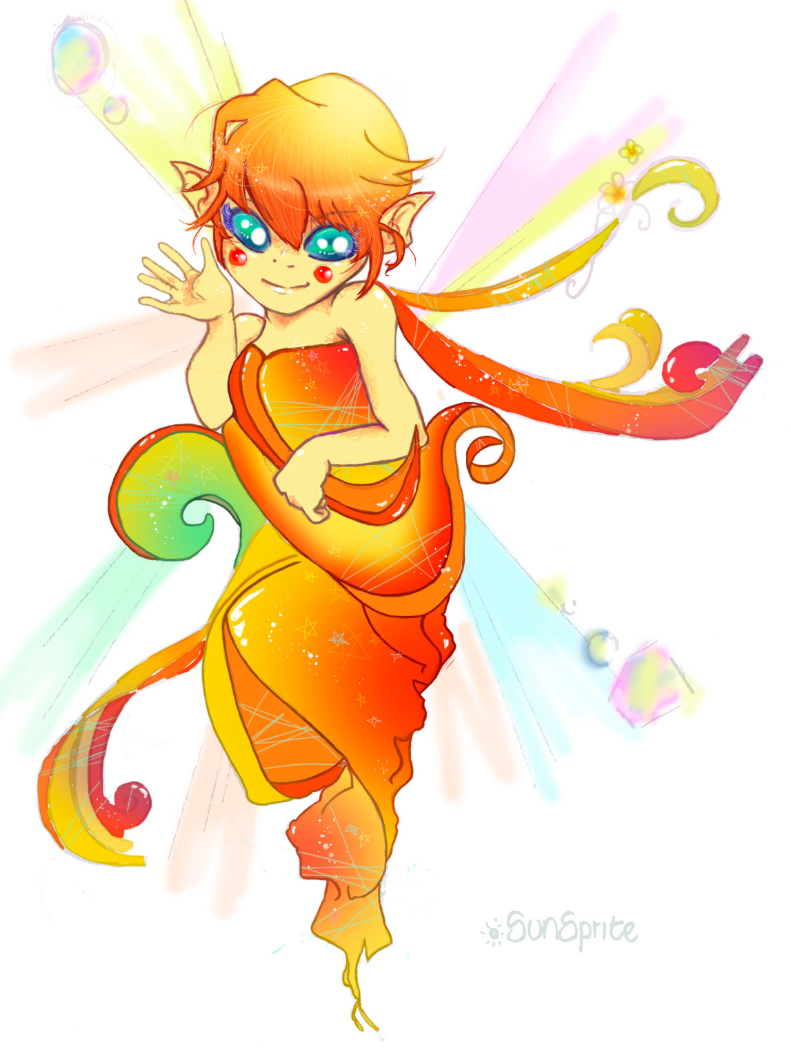
I decided to attempt to enter the Macmillan Book Prize, with a bit of an odd story all the same but I hope it works out. I've been working on a colouring style for one of my characters, the sun sprite. I got a new tablet over Christmas so I've been finding colouring and lining so much easier.

  The example above is my progress so far - I'm completely relining the piece as the examples shown above the lining is blotchy and thick, whereas this looks much smoother and more natural. Whether this is because the pen I used to line the image originally bled to much I'm not sure yet. 


-- and a close up - I'm thinking of layering a few more filters to maybe soften the shades a tad when the lining is finished. Despite this being a fairly lengthy process I feel I can afford to take the time to shade my characters effectively as the nature of my story calls for backgrounds mostly involving clouds and air space therefore the majority of the backgrounds shouldn't take long nor would they need to mimic such excessive detail.


Wednesday, 18 January 2012

Age UK Brief : Life Stories

[Faces pixelated for privacy reasons]

The deadline for the Age Uk brief: Life Stories is this coming Friday, I was never happy with my original submission so I've been reworking it. The whole collage technique was new to me as I usually prefer to work digitally and so my previous submission lacked composition and a strong focal point. I had tried to show all aspects of Cheryl's life with the intention to portray it as meaningful and full, but it ended up looking to cluttered and weak. 

During my chats with Cheryl I had learnt that she used to be an artist - and that she had several pieces within her home. However unfortunately due to the nature of her condition she couldn't recall what the works actually were of nor the medium she had used, so I was never able to portray this within my collage.

It was only when I was able to meet with the clients and hear their feedback on my piece that I learnt that those works Cheryl had produced were of Egyptian hieroglyphics and pieces. I wanted to incorporate the theme of these paintings into my own collage since they were a large part of Cheryl's life. I started by attempting to mask Egyptian markings over my initial piece. 

This really didn't work out well and I disliked it straight off the bat.


With my tutors suggestion I attempted a full mask, this worked better, but I was still unsure about the overall look. So I attempted my original idea to recreate the collage around the new elements I'd found.


During my rearrangement I came up with this example which I felt worked fairly nicely, it lacks the Egyptian influence however, although it felt like the pieces were laid out similarly to that of hieroglyphics.


This was my final outcome, a piece that uses the Egyptian eye as the centre piece including the patchwork quilt of Cheryl's close family and Scottish ties, the heart locket depicting her and husband, an ariel view and photo of the Eiffel tower, music scores, the knotted string depicting her marriage and the lipstick.
I choose to paint the eye in red as Cheryl had mentioned red was a favourite shade of hers. 

I intend to display all of the above examples and allow the clients and my tutors to pick the one that works best in their eyes. But for myself the final is the one I am most satisfied with. 


 I kept my vignette simple, again making use of the mini patchwork quilt and the heart locket and chain to create a natural and personal feeling. The vignette focuses mostly on Cheryl's family.


My transcript focused on informing the viewer about Cheryl, her likes, experiences and current lifestyle. Which I'm hoping will allow them to use this knowledge, not only to get a better understanding of Cheryl herself but also, to further understand the reasons for certain elements within my collage. I refrained from adding the Egyptian paintings into my transcript because it wasn't something I was able to learn from Cheryl herself and thus would rather allow them to sit within the collage more as a mystery than another piece of standard information. 

Tuesday, 17 January 2012

Illustrative storyboard examples

My last post was getting really long so I decided to post these two examples separately, I originally found them on a tumblr feed, but I love the styles and layout of both. I'll start with my favourite of the two - The Shut-in Princess. It's a modern day illustrative series that I believe many people can relate to fairly easily in this day and age. I love the drawing and colouring style and the use of hand drawn font that interacts with each frame ties each image together really effectively.


The second example uses a limited colour pallet and a more simplistic style but the overall effect works well in my opinion. It has a childish appeal and innocence again it features a hand drawn font but it remains consistent throughout - the way the pages are set up reminds me of a diary of some sort.