 |
| Click for animation |
Omocat
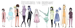
I stumbled across an artist on tumblr called 'Omocat' - she's produced some fan works from a game series I'm currently playing which is how I first came across her. Her work appeals to me so much not only for the style and unique choice of colours but also for the animated appearance. Though it's usually just an animated texture or an animated outline it allows a 2D flat image to be something - more. You can still appreciate the image printed out on paper unmoving, but this way makes it more exciting when viewed online. It stands out among flat unmoving illustrations and really makes use of the hosting media for what it is. Since so much work is becoming digitalised nowadays and the majority of it ends up on blogs and websites this style allows the work to take full advantage and remain effective and eye capturing.
<The pieces that originally caught my attention - based off the game Skyward Sword>
Click for animation above & below
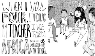
I found a mini book she had produced, I'm rough on the details but I found the concept really interesting - I loved the typography and illustration used <3
I found she was the artist of a comic I had also featured on a tumblr feed a few weeks ago it was based off the lyrics of a song - but again the presentation and typography were so well put together
The transitions and breakup of text and imagery along with the layout and spaces is really effective through out. The expressions and actions really mimic their purpose.
Click for animation above & below
Her things can be fairly dark and gruesome at times but I still find it interesting and surreal to look at. Her work has a sense of maturity within it despite from what I can gather being fairly young.
Click for animation above,
I find her work relevant for my blog in terms of animated style, it's definitely something I would like to attempt at some point in the near future with my own work.


No comments:
Post a Comment