Sunday 30 December 2012

2013 Calenders

For Christmas and New Year I decided to make a small calender to give out among some friends and family  sort of on a whim. I had been browsing Etsy for some gifts and came across a series of handmade calenders which initially inspired me. 

Listing


I was really fond of the A5 format and handmade feel. To create the content I picked 11 friends from my list and asked them a series of questions. [11 because I slipped one of my own in to cover all 12 months]
Favourite Animal
Favourite Colour
Favourite Fruit
Favourite Accessory

This enabled me to give the imagery a personal touch and create some interesting collections. 


The images were drawn using a pencil and outlined in fine liner and then scanned in. I also decided on the months for each image as unfortunately the people who I selected had similar birthday months and in other cases didn't distribute the colours well through out the calender. So I layed them out and decided on an order that worked best. 


I then added the base colours to the sketches and cleaned up the line art. 


Then the texture was added and the colours were fiddled with and brightened to create the best combination.

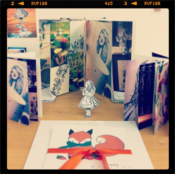
I then typed out the calender for each month and coloured the text to match the favourite colour of each individuals page. The pages were printed on 210gram card sliced and gathered with an orange ribbon. 


I've included a copy in my porfolio and since it's so simple to create now that it's finished - it would make a really good self promoting gift for any interviewing clients I have in the future. 


Tuesday 25 December 2012

Mini Exhibition and Disney Zine


We had to set up a mini exhibition at the end of the term before breaking for Christmas, Critical Journal time.
To display all the work from the beginning of the year including the personal  development of our business cards and portfolio's. 


In between the rush of prepping my work I was able to spend some more time on my Disney Zine by adding some more sketches. It's still a work in progress but I'd rather take my time with it as opposed to rushing the final product - #which is fine as it isn't the final piece for the brief. 
 

Thursday 20 December 2012

What does 'Illustration' mean?

Personal project
2012
I believe the answer to this question is as vast and wide as the question itself. The answer will be a personal viewpoint of the individual asked - and there is no right nor wrong answer.
The ironic thing is most people outside of the industry don't have much of an idea of what illustration is. I generally get asked what I'm studying at uni by customers at my job - and 99% of those who have asked have pulled a face of puzzlement upon hearing me say illustration. 

"Is that like ... them book pictures?"  - Said the other 1%
Illustration for me is many things. As suggested by Michael Salu in his article in Varoom Magazine [2012] "As our visual language evolves, the playing field is levelling. Graphic designs, sculptors, painters, creative developers and even musicians amorphously meander across different parts of our creative industries." Illustration is many things, consists of many parts and is practised by many individuals. You don't have to be an illustrator by trade or job title to do an illustration, in the same way that drawing is not the only form of illustration - it is a net that stretches outwards and covers many creative outlets. 

It can be used to send a message, make a point, communicate words, look pretty, be random, satisfy an urge, entertain, sadden and surprise people. It can be done through music, fonts, acting, film, photography, drawing, painting, hand movements, shadows, light.

I believe illustration to be an act of creative outlet - with many segments. There is the obvious act of 'illustrating' - portraying something to the audience, through storybook writing, events, diaries through imagery. There is also personal illustration - when an artist will be conveying a point of their own, making a statement - or just illustrating because it takes their fancy - taking inspiration from something around them and putting it to paper, wood, film etc. 

Interestingly the term 'illustration' originates from the 14 century and was used to convey 'a shining', 'a manifestation' and 'a spiritual illumination'. The word itself is taken from the Latin word 'illustrationem' which meant 'vivid representation'. Its meaning has slowly adapted and changed over time, and by the 1580's 'illustration' meant a mental sense of an 'act of making clear in the mind' - by 1816 it meant 'an illustrative picture'. Thus it is clear that now in this day and age once again the meaning behind the word 'illustration' has changed once more and adapted to cover a vast scope of creative outlets. 

My own work originally started out traditionally, pencil, crayons and paints, yet over time I've practised with 3D elements, collage, photography and digital and tablet work. I've briefly touched on animation, which is something I'd like to take further and am really pleased to find out we will be doing so after the critical journals are done and dusted. Like the term - my 'illustration' has adapted and now covers a vast scope of techniques and styles yet remains the definition of 'illustration'. 

I think a name change for illustration is unnecessary. Unlike many things 'illustration' has managed to adapt and modernise, this is a feat in itself and should remain as so. From it's original standing in the 14 century it has evolved and still stands strong in 2012. 

Sunday 16 December 2012

MUSIC | live brief


We're coming to the end of a live brief with a music design company in Manchester - ironically named 'Music'. We're working to create an instillation that will cover their 'fishtank' two rooms made of glass within their office. The design must be based around a piece of music - but without obvious puns, music scores etc.
It must also make creative use of the two way glass and it's surroundings.

I have decided to base my design on Mayday Parade's Black Cat. 


I have taken inspiration from the lyrics to produce the below design.
It makes use of the references to tape reels, directing, the city, the black cat, bleeding, stars and flames.


I attempted to create an example panel using illustrator but found it frustrating and inconvenient to use. It took to long and was overly complicated especially when trying to create the dribbles of paint.


I returned to photoshop and found the design much simpler to work with. While I was aiming for a more vectored appearance in this work - it's not really my personal style. The below product has the pretence of a vector but is still hand drawn and thus has flaws. I do prefer this though. 


To make full use of the glass the below image is the inside of the room - where the buildings have been set alight. There are other examples of this throughout the design - including a change of expression on the cat. 

Friday 14 December 2012

Portfolio Review #1 FaBi Books and Artworks


I  had an informal meeting with my tutors yesterday in regards to the progress of our portfolios, I took thier advice and made adjustments to the layout and overall look before sending it off for its first review.

I was fortunate to get Thomas and Christopher of FaBi Books and Artworks, whom I had previously interviewed earlier this summer, to look it over for me. Thomas's interview on my blog can be found here 

"We both thought it was great - don't think you need to change anything, Chris thought it had a great urban design feel, very current and that you showed great how create your designs in a way they can be used in a few ways - me, I just thought it was great.. loved the designs and loved the layout thought it had a great flow.. there wasn't a single piece I thought - meh - I loved each one.So unfortunately we where useless to you as we loved it - Chris's only thing he would change he said would be possibly re-sizing some of the pieces he felt some where a little lost to the white on the page and felt they could have been showed larger.. but I kinda liked that who exhibit feel the pictures framed on the white page gave so I think it is a personal choice..
Really fab Emi you should be very very proud of it - your work is fantastic If you need anything else just let us know and thanks for letting us have a peek at your work it was very awesome"

Taking their thoughts on the layout regarding white space I have been considering what feel I'd prefer to give the work. Advice from my tutors was to separate two images that showed the design for a T-shirt and tote bag alongside a set of photographs showing them in this format - this was picked up on during this review in the first line. Thus I think the amendments were successful by giving them space to exhibit. 

I also changed the format for some images giving it an overall portrait layout which I believe has helped in the 'flow' mentioned above in Thomas's comments. I am much happier with the layout and appearance of my portfolio - I'm currently working towards getting an A4 box to use for personal meets and talks, for which I may be able to include one of my printed T-shirts and some of my zine work. 

Tuesday 11 December 2012

Hopes, Fears and Opportunities

At the beginning of the new term we were asked to write a short post in regards to our personal hopes, fears and opportunities regarding the future. 

Hopes I hope to create work I'm pleased with, to produce a successful portfolio and receive good feedback from it. I hope to be proud of my work, get it in print, and see others enjoying it also. I'd like to improve my confidence in regards to talking and meeting clients - presenting my work and selling my skills to employers. I'd like to establish my standing within the community with a good website, identity and professionalism, and naturally I'd hope to receive a fair amount of commission work over the next couple of years to continue this and progress further. I also hope to achieve, explore, develop and maintain my own personal style to give my work the consistency clients request. I'm finding this more successful by the use of my critical journal. Lastly to have a standing that enables me to have enough say in the work created, to do the work I enjoy  - be granted a freedom with my work.

Fears like most people my biggest fear is not being good enough, sinking into a sea of an over subscribed job role and not being able to project my work or self. Having to give it all up and work in an office somewhere. Comparison - when I try to see my work against other people's, I fear that I'm not good enough and find it difficult to picture my work being used for anything professional. I see people far more talented than myself without work, working in a different department entirely. Presentations and meeting clients are still a part of this pathway that scares me. I fear when accepting a job - not being able to complete it - either due to time or in the standard they want, not being able to satisfy the client. I'm afraid of the uncertainty of my future as I will be relying on finding work. I fear illustration becoming too serious, stale and over worked for me due to complying with certain clients wishes or dull briefs.  

Opportunities To share my work with others, receive feedback and help. To participate in live briefs - to gain experience and a better understanding of timescale and requests. To see the work of people around me and be inspired and encouraged to continue to push my own further. To debate and seek opinions and thoughts of my peers when needed. To explore my style and apply different techniques and produce a portfolio with a range of work to suit clients needs and preferences. Becoming accustomed with exhibitions, and reaching out within the community to make an impression.  To be given a freedom in my briefs to explore and satisfy my illustrative interest. 


Website research


In preparation for creating my own illustrative website to showcase my work I did some research into other websites created by and for illustrators within the market. There were a range of different approaches and themes but one thing that stands out is the use of their own imagery and fronts within the format. Obviously this is a key point for an illustrator - to allow the website itself to act as it's own portfolio and not just a blank wall to display their own on.

There was a distinct preference for minimal content and colour on all those I came across. This allows the work to take centre stage as intended. The most successful ones were easy to navigate, colourful and fun to view. 


I am fond of this format - that shows a limited amount of links at the side while allowing a large example of work to be viewed in the centre. It is simple and easy to work while effective.


I am also very fond of the thumbnail approach to display the work. It keeps the page uniformed and modern.


I especially liked Liz Clements website for it's use of handwritten text and profile image. The colour scheme within her work works beautifully together as a bonus. This allows her website to neglect a background or any boxes and frames. 


I also found a number of websites that had their own 'cover' page, that required the user to enter into the website. I think this gave the page a nice professional look and allowed the user to confirm they were in the correct place, and gently ease them into the website.


From this I have gained many ideas and much inspiration into how I would like my final website to appear. I have also been given a better understanding of appropriate content, links and information. 

. A page or bio about the illustrator - their qualifications/ past experiences/ their CV
*Although this is generally kept to a minimum to avoid a wall of text.

. Contact - email, telephone, addresses or forms for filling out when requesting work and likewise.
Most importantly a link to the artist's blog also - allowing people to keep up to date with his or her's going ons in life. Current interests and styles. 

. Links - links to other websites the illustrator displays their work - other means of following them, adding to their exposure. 

. Gallery - obviously pages to exhibit the illustrators work, generally split into consumerism [commission work] and their personal. 

. Shop - for illustrators who create and sell work, prints, crafts. 

I have started work on my website, and while it still needs a lot of work it's slowly getting there!
 I have also been contemplating wether or not to have an illustration tag name rather than my own. Currently I'm looking into using my initials 'ELM' for a possible identity. 


Tuesday 4 December 2012

Business Cards

I've ordered 50 cards as part of our course requirement of the below designs.
There are two different front and one back. 

Front A

Front B

Back

I have used the website address for this blog as my personal website is still being made.
I did experiment with some other imagery, which could be used as potential designs for the future. I was limited this round as I'm only given the option to use one back design per order.