[Faces pixelated for privacy reasons]
The deadline for the Age Uk brief: Life Stories is this coming Friday, I was never happy with my original submission so I've been reworking it. The whole collage technique was new to me as I usually prefer to work digitally and so my previous submission lacked composition and a strong focal point. I had tried to show all aspects of Cheryl's life with the intention to portray it as meaningful and full, but it ended up looking to cluttered and weak.
During my chats with Cheryl I had learnt that she used to be an artist - and that she had several pieces within her home. However unfortunately due to the nature of her condition she couldn't recall what the works actually were of nor the medium she had used, so I was never able to portray this within my collage.
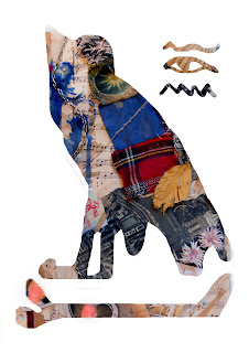
It was only when I was able to meet with the clients and hear their feedback on my piece that I learnt that those works Cheryl had produced were of Egyptian hieroglyphics and pieces. I wanted to incorporate the theme of these paintings into my own collage since they were a large part of Cheryl's life. I started by attempting to mask Egyptian markings over my initial piece.
This really didn't work out well and I disliked it straight off the bat.
With my tutors suggestion I attempted a full mask, this worked better, but I was still unsure about the overall look. So I attempted my original idea to recreate the collage around the new elements I'd found.
During my rearrangement I came up with this example which I felt worked fairly nicely, it lacks the Egyptian influence however, although it felt like the pieces were laid out similarly to that of hieroglyphics.
This was my final outcome, a piece that uses the Egyptian eye as the centre piece including the patchwork quilt of Cheryl's close family and Scottish ties, the heart locket depicting her and husband, an ariel view and photo of the Eiffel tower, music scores, the knotted string depicting her marriage and the lipstick.
I choose to paint the eye in red as Cheryl had mentioned red was a favourite shade of hers.
I intend to display all of the above examples and allow the clients and my tutors to pick the one that works best in their eyes. But for myself the final is the one I am most satisfied with.
I kept my vignette simple, again making use of the mini patchwork quilt and the heart locket and chain to create a natural and personal feeling. The vignette focuses mostly on Cheryl's family.
My transcript focused on informing the viewer about Cheryl, her likes, experiences and current lifestyle. Which I'm hoping will allow them to use this knowledge, not only to get a better understanding of Cheryl herself but also, to further understand the reasons for certain elements within my collage. I refrained from adding the Egyptian paintings into my transcript because it wasn't something I was able to learn from Cheryl herself and thus would rather allow them to sit within the collage more as a mystery than another piece of standard information.


