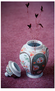
I tried merging some of my other photos within the previous shots, some were more successful than others. I found that to achieve the best result the location image ought to match the perspective of that of the hole it was being placed within.
I also found that having elements of the image coming out and merging with the outside/real life image made it even more effective/believable.
I experimented with some illustration work as opposed to photography. I do not own the illustration work - I used them as examples to test how it looked.


I love the concept of this! It's really cute and it ticks all my boxes.
ReplyDeleteYou're right, some of these do work a bit better than others... and it is down to the perspective really. If you want to take it a bit further, it helps to sketch out how you want the photo to look so you get an idea on what angle to shoot at. That's what we did in our digital editing module.
But saying that, what you've got here is outstanding anyway! I love the more nature like ones the best, especially since you've got something coming out of them, making them a little more 3D.