
[Will continue to update this post as I work]
I've started drawing out and colouring some pages so I have a better idea of how it looks when it's all complete.
Originally in my first plan I used a square page template - I then drew them out in A5 sized boxes.
I then decided they looked much better 300x300mm thus I reverted back to this and modified my drawings to suit the frame. I've been really torn over how to shade/line and colour these pages, my original method on my previous sketch meant relining using my tablet pen on PS - but this did take AGES. So I tried an older method using Flash to achieve a smooth varied line - this was faster and just as effective.
I've gone for a sort of scribbled look - overlaying lots of old textures I created for a previous book project [The Iceberg] I've tried to limit the shades to a degree - but I find the more colourful it is the more appealing it is for a child.
I think with art styles - a child doesn't comprehend these sort of details - such as a limited colour pallet - a child wont look for a reason or find an appealing nature from this like an art student might. During my child development course a few years back I was taught that children are drawn to colours and shapes naturally as part of their development. Therefore I have let more shades surface within the imagery alongside various textures, prints and smaller details to generate interest.

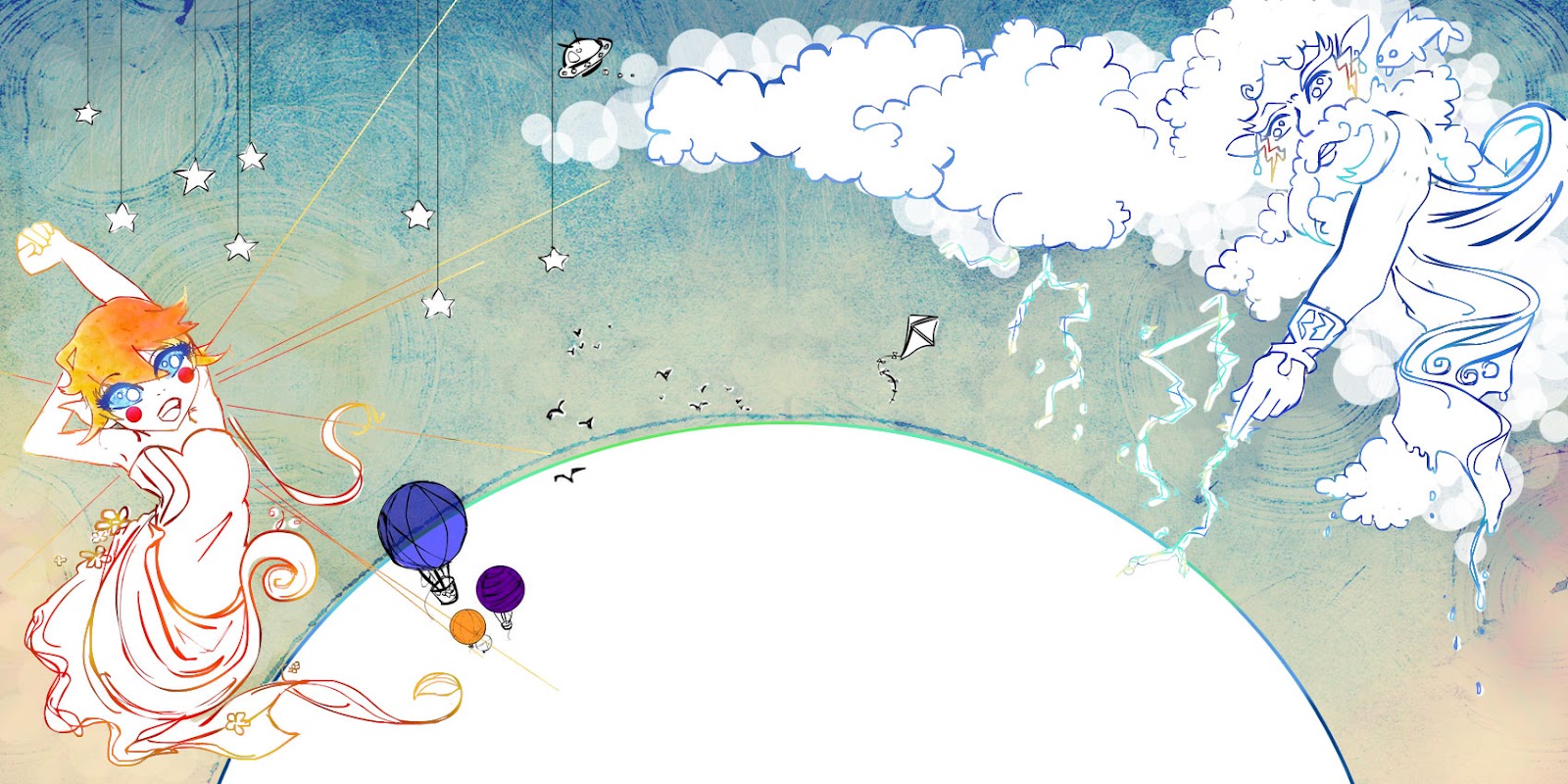
As this page deals with a confrontation I have made the bordering lines particularly scribbley and chaotic.

[an example of a double page spread]


Complete double page spread.

/Example showing bleed margins and page fold
No comments:
Post a Comment