Friday, 23 November 2012

Rome!

I visited Rome for the first time a couple of weeks back! The city was stunning and full of beautiful architecture, we visited just about every main attraction there was on the map so it was a very busy week.
There were a few sites [where I have no images] due to photo restriction rules - such as the Cistine Chapel which completely took my breath away - and the Capuchin Crypt, which is made entirely of human skeletons. 


We stayed in an apartment block about 10minutes walk away from St Peters Square - it had a really old lift which fascinated us.


We had to climb over 500 steps to reach the top of the dome and the outlook area on top. The passage ways and steps got narrower and narrower the closer you got - and while circling the dome the passage way became slanted which gave the whole thing a very surreal feeling. The last stair case was a windy turret with only a rope to hold on to - it was extremely tight.


We also came across a 'ghost bike' I had no idea what it was so when we got back to the apartment I did some looking up on the internet. I think it's a really nice idea and a shame it isn't done more often around the Uk /despite the sad reason for one being needed. It's a nice memento. 


Thursday, 22 November 2012

Tshirt Design | BMW Brief


I did some small experiements with the T-shirt format using a stock image and the outline of the design. I played with the positions and sizes to find the best look.


I prefer the centre design which displays the image large and eye catchingly. I also did a mock up using a black shirt. 


Using one of my watercolour experiments I did a mock colour test again the white shirt. 
I will be using T-shirt transfers once I have settled on my image.

New Years Card | BMW Brief

New Years Card design
BMW Brief


Initial pieces scanned in.


Pieced together on PS following original sketch plan.


Stars and hole tone added to mark when the card will be cut.


Then overall smoothening out redrawing the lines using shape tools and connecting the lines - redrew the '1' shape to look freer. 

Now I need to experiment colour and texture wise with the image and do some mock ups.


Monday, 19 November 2012

Paper fish and stars

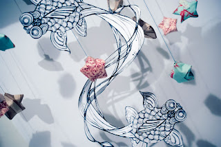
I have been practising different display techniques with my paper fish to avoid a flat appearance. The other day I cut one of the designs up and strung it alongside several handmade stars with a little makeshift studio backdrop. My lighting was very basic and the backdrop was made from several pieces of paper so in all it can be massively improved in the long run. Regardless it brought to light several things - one being that the images need to be backed or printed on thicker paper to stop them from spinning/curling from the cut. The stars also needed a specific method of taping the string to allow them to hang properly. 
I'd like to experiment further with this once I've finalised my other designs.


Tuesday, 13 November 2012

Workspace


We redecorated our work spaces for the latest project.


Chinese Kites

For the current project revolving around BMW's charity work I have decided to base my work around Chinese Kites. During my intial research I learnt about the meanings behind different colours and animals within the Chinese folklore and settled on presenting the goldfish who signifies abundance of energy and wealth with the Magpie who spreads happiness and luck. Colour wise I have selected the good fortune of red and wealth of gold, beauty of yellow, purity of white and power of black. 
My work will portray the Magpie and Goldfish in the form of Chinese kites alongside Chinese lanterns and starry night skies with added fireworks for some design aspects. I did some initial sketches experimenting with various forms and shapes of kite for both goldfish and magpies. Currently I am finalising one design that portrays the goldfish similarly to the yin-yang symbol. 


I have decided both on my own preference and a majority vote that the above image works best. I have warped the tales slightly so bring them in closer and rounded the string more to make a neater circle. I like how the tails collide and flow together. 
The main aspects behind the design is to signify positive outlook, light and hope, fun and freedom.
I believe kites can represent this well both in their free flowing form, playful nature and contrast against the dark sky. I intend to make them appear to be glowing or 'lit' within similarly to the Chinese lanterns.